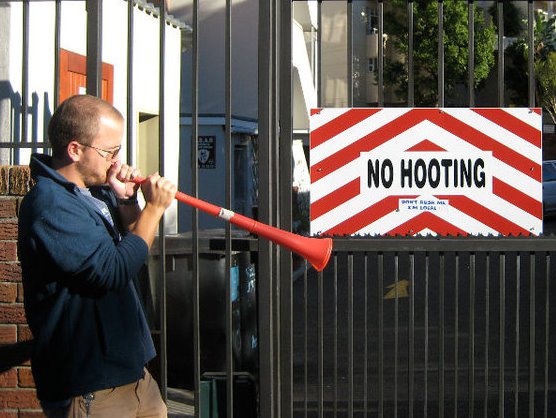
I've customized the layout of this place a little. I inverted the color scheme, changed the font and my picture, and removed that annoying blogger header thingy at the top. I find the black background-white text to be a lot easier on the eyes, but I'll switch it back if people hate it. I was also thinking about changing the header picture (though I do like the current one a lot, it doesn't seem to fit very well now). Any thoughts? (And yes, I know the beard is ridiculous.)
UPDATE: Well, after letting it stew for awhile, I decided to switch back to dark text, light background. The main issue was that bolded text was almost impossible to see regardless of the font I picked. So now I'm going for a kind of old-school parchment look. Again, feedback would be highly appreciated.
UPDATE II: And now I've redone the header as well. The picture is of the Little Colorado far up in the drainage, and I like it a lot and think it fits. The font is a little goofy I reckon, and I'll work on it again tomorrow. I also made it narrower, to fit more actual text in the main screen. Overall thoughts? Am I headed in the right direction? Thanks again for the comments.

I hardly recognize you with a beard, and I'm your little sister! That's kind of scary. The new layout looks good, although, I think if you change the picture it needs to be another picture of a river. I have plenty from flash floods this monsoon season. We're missing you on our trips!
ReplyDeleteThanks for the feedback! I'm missing those trips too, though it looks like I might manage a trip down the Zambezi this December! I'll keep my fingers crossed. Email me a couple pictures if you think there are some good ones that might fit the new look.
ReplyDeleteSorry Ryan, I liked the old look better. But mainly because I find it hard to read white on black. My frailty, I understand. I also liked the old picture. I just love that hat. Would read your blog anyway, so don't change for me. B
ReplyDeleteWell, that's one vote for and one against. Anyone want to invoke cloture?
ReplyDeleteI say keep the beard, but of course as a bearded male I am biased.
ReplyDeleteAs to the layout? I like the colors but the picture stands out too much against the orange color. Maybe fool around with the new Layout Editor function? Also.. if you want to create a real header, you can easily make one at Picknik.com or Fotoflexer.com, which are great and easy to use.
Hrm... I'll take that into consideration. Perhaps a different picture.
ReplyDeletelove the new picture. dramatic and beautiful, plus it reminds me of dad's story. It's looking good. Mski
ReplyDelete